Wednesday, 24 March 2010
Evaluation questions
Evaluation Questions
1. In what ways does your media product use, develop or challenge forms and conventions of real media products?
2. How does your media product represent particular social groups?
3. What kind of media institution might distribute your media product and why?
4. Who would be the audience for your media product?
5. How did you attract/address your audience?
6. What have you learnt about technologies from the process of constructing the product?
7. Looking back to your preliminary task, what do you feel that you have learnt in the progression from it to the full produc
Monday, 22 March 2010
Audience
We decided that our film would have to be a 15 because it has themes of murder, but there are no guns, or sex, these are the normal guidelines for a 15
Discrimination
The work as a whole must not endorse discriminatory
language or behavior.
Drugs
Drug taking may be shown but the film as a whole must not
promote or encourage drug misuse. The misuse of easily
accessible and highly dangerous substances (for example,
aerosols or solvents) is unlikely to be acceptable.
Horror
Strong threat and menace are permitted unless sadistic
or sexualised.
Imitable behavior
Dangerous behaviour (for example, hanging, suicide and
self-harming) should not dwell on detail which could be
copied. Easily accessible weapons should not be glamorized.
Language
There may be frequent use of strong language (for example,
‘fuck’). The strongest terms (for example, ‘cunt’) may be
acceptable if justified by the context. Aggressive or repeated
use of the strongest language is unlikely to be acceptable.
Nudity
Nudity may be allowed in a sexual context but without
strong detail. There are no constraints on nudity in a
non-sexual or educational context.
Sex
Sexual activity may be portrayed without strong detail.
There may be strong verbal references to sexual behavior,
but the strongest references are unlikely to be acceptable
unless justified by context. Works whose primary purpose is
sexual arousal or stimulation are unlikely to be acceptable.
Theme
No theme is prohibited, provided the treatment is
appropriate for 15 year old.
Violence
Violence may be strong but should not dwell on the infliction
of pain or injury. The strongest gory images are unlikely to
be acceptable. Strong sadistic or sexualised violence is also
unlikely to be acceptable.
There may be detailed verbal references to sexual violence
but any portrayal of sexual violence must be discreet and
have a strong contextual justification.
Comparing characters


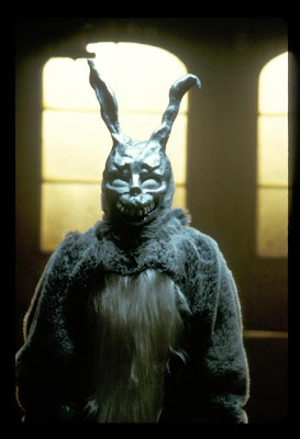
The main character in our opening is much like the main character in Donnie Darko he has gone a little insane and hears the voice of "Frank" the bunny, in our opening the main character hears the voice of his dead daughter.
Thursday, 18 March 2010
- We thought that you held the shots steadily all the way through were appropriate.
- We liked the way you did different angles during the scenes in the church and and the way you did closer ups and different distance shots.
- We thought your thriller material contained a lot of thriller conventions and we liked the way you used them in your footage.
- We really liked the fact you made your flashback footage in black and white, it really went with the theme of a thriller with a hint of eerieness. The footage is all in a good light and sets the atmosphere well.
- The cuts were in good places and the scenes weren't too long which kept us interested.
- The sound was good, helped with the atmopshere, was a bit repetitive, but good. We thought the little girls voice was a bit creepy, but also a bit horror like.
- The title was a bit a random, but then we didn't really understand what the narrative was clearly. The beginning title and the end title... the ends were cut off, didnt understand why?
Wednesday, 17 March 2010
A coffee in the morning analysis
Thursday, 11 March 2010
Feedback for our thrillers
Monday, 8 March 2010
Photoshop saving
Save as web and devices
PNG 24
Tick transparency


